Project ECHO
Selected dashboards, documentation, and internal tools from my internship at Project ECHO.
Role
Technical Writer - Intern
I worked as part of the Data Team at Project ECHO, focusing on data visualization design and implementation.
Overview
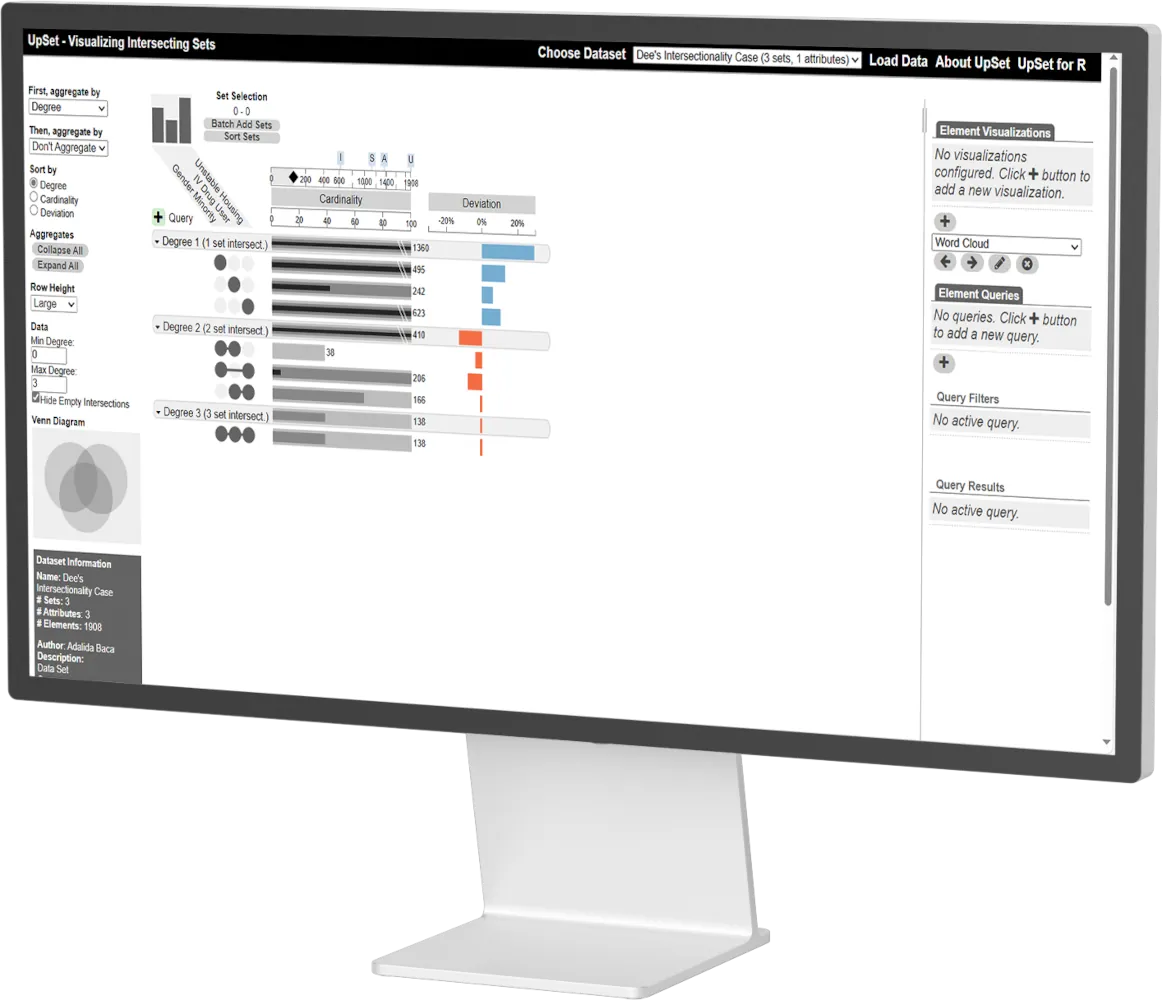
A researcher at Project ECHO needed a way to present intersectional health data involving three vulnerable populations: gender minorities, individuals with unstable housing, and IV drug users. The work was part of an internal effort to improve how complex datasets were communicated across research, reporting, and funding contexts.
Problem
Structural Data Mismatch
The challenge was to communicate the intersectionality of three vulnerable populations.
The existing static Venn diagram was a mathematical mismatch for the data; it obscured the magnitude of overlaps and forced researchers to rely on mental math to compare populations.
GM = Gender Minority
IDU = IV Drug User
UH = Unstable Housing
7
sets
Insight
Seven Intersection Points
Three populations do not produce one overlap; they produce seven distinct, meaningful intersections.
Once the problem was redefined as a set-intersection analysis rather than a grouping exercise, it became clear that a matrix-based approach was the only way to provide decision-ready clarity.
Approach
Scalable Visualization Methods
I looked for visualization methods that explicitly represent and compare intersections across multiple groups.
This led me to UpSet plots, a well-documented solution to a known visualization problem, supported by an interactive and reusable implementation.
Solution
Interactive Systemic Clarity
I replaced the static Venn diagram with an interactive UpSet plot that makes each intersection explicit and comparable.
Unlike the original visualization, the new approach allows intersections to be isolated, compared, and explored individually. This reduces the need to mentally track overlaps and makes differences between populations easier to see and discuss.
Because the visualization is interactive and data-driven, it can be reused as the dataset evolves, rather than recreated as a static image each time.
Standardizing Research Communication
The interactive UpSet plot was adopted as the primary reporting standard for intersectional data within the organization. By moving from a static image to a data-driven framework, the research lead was able to communicate health disparities to stakeholders with immediate clarity, removing the friction of manual data interpretation.
Key Takeaways
IA is Strategy
Naming the specific comparisons needed made the solution discoverable. Correctly identifying seven intersections transformed a data mess into a navigable UI.
Systems Thinking
Clear thinking transfers across domains. The same set-logic used for health data applies to any multi-set intersection problem in SaaS, FinTech, or AI.
Avoiding Wasted Work
Leveraging an established solution (UpSet plots) delivered clarity faster than building a bespoke tool from scratch. Good judgment prioritizes outcomes over busy work.
Want an in-depth walkthrough?
Get in touch for a detailed walkthrough or to discuss next steps.